
Since Thyme began we’ve been busy creating… creating for print, packaging, identities, display, for web and anything else where outstanding design makes a difference. Since 1990 we’ve been providing engaging experiences through bespoke and relevant design for many varied clients, whether startups or global brands.
First impressions count. Through our designs we help our clients evolve and grow their businesses. We make sure our clients are one step ahead and that the look of everything seen by a potential customer communicates effectively, whether it be a logo, printed brochure or new website.
We believe in word of mouth. It is likely you have found us for this very reason.
We also believe in letting our work do the talking, so delve deeper into our new site to get the real taste of Thyme.
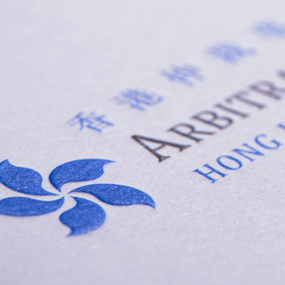
Our clients look to us to help them stand out, enable growth, and become more relevant in their marketplace. We help build an identity for your business that engages, a personality your clients can relate to and be inspired by. It all starts with a new or reinvigorated logo, one of the most important aspects of any business, and grows from there.
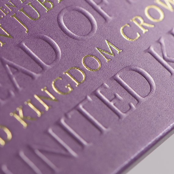
Luxury design is all about extreme perfection. Something we know a lot about. Just as with all our projects we strive for it and in doing so show how fanatical we are about the smallest of details. 1mm here, 1mm there, 1% of colour, specific alignment... you get the picture - it makes a difference and we notice when it's not done exactly right.
We are always busy creating beautiful yet functional websites. Unique and engaging, specific to our clients' needs. All are responsive too, just the ticket for all those smarphone zombies. What makes us different is that we combine our vast experience of print layout design such as typography and spacial awareness, with our expertise in digital design.
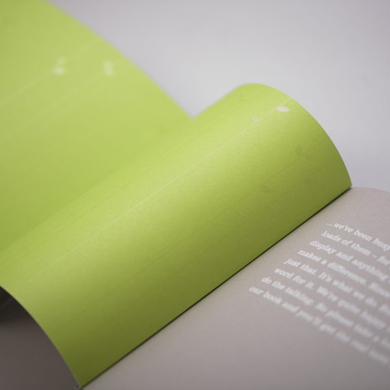
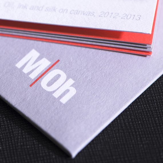
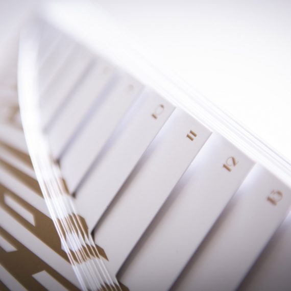
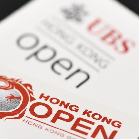
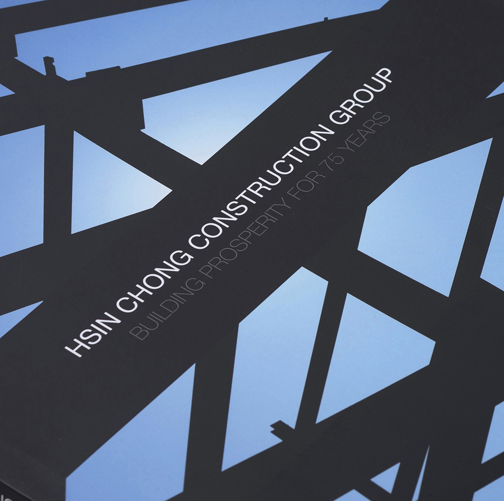
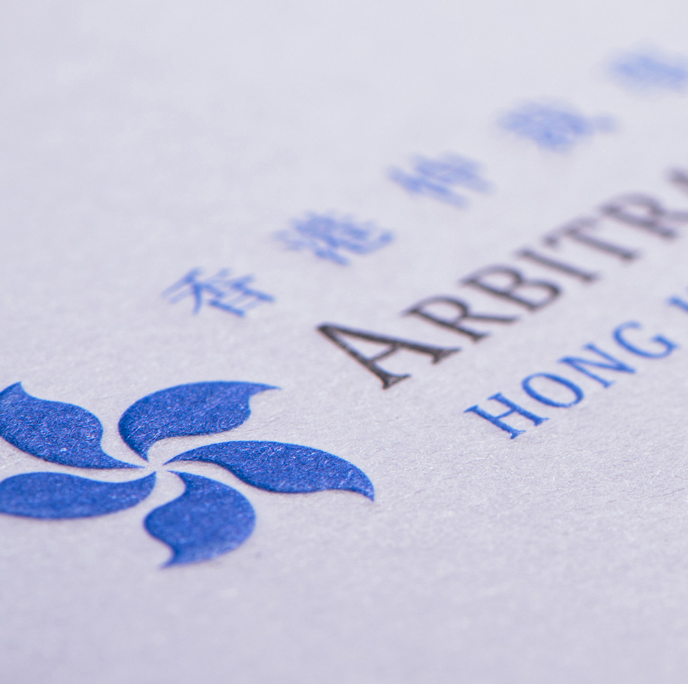
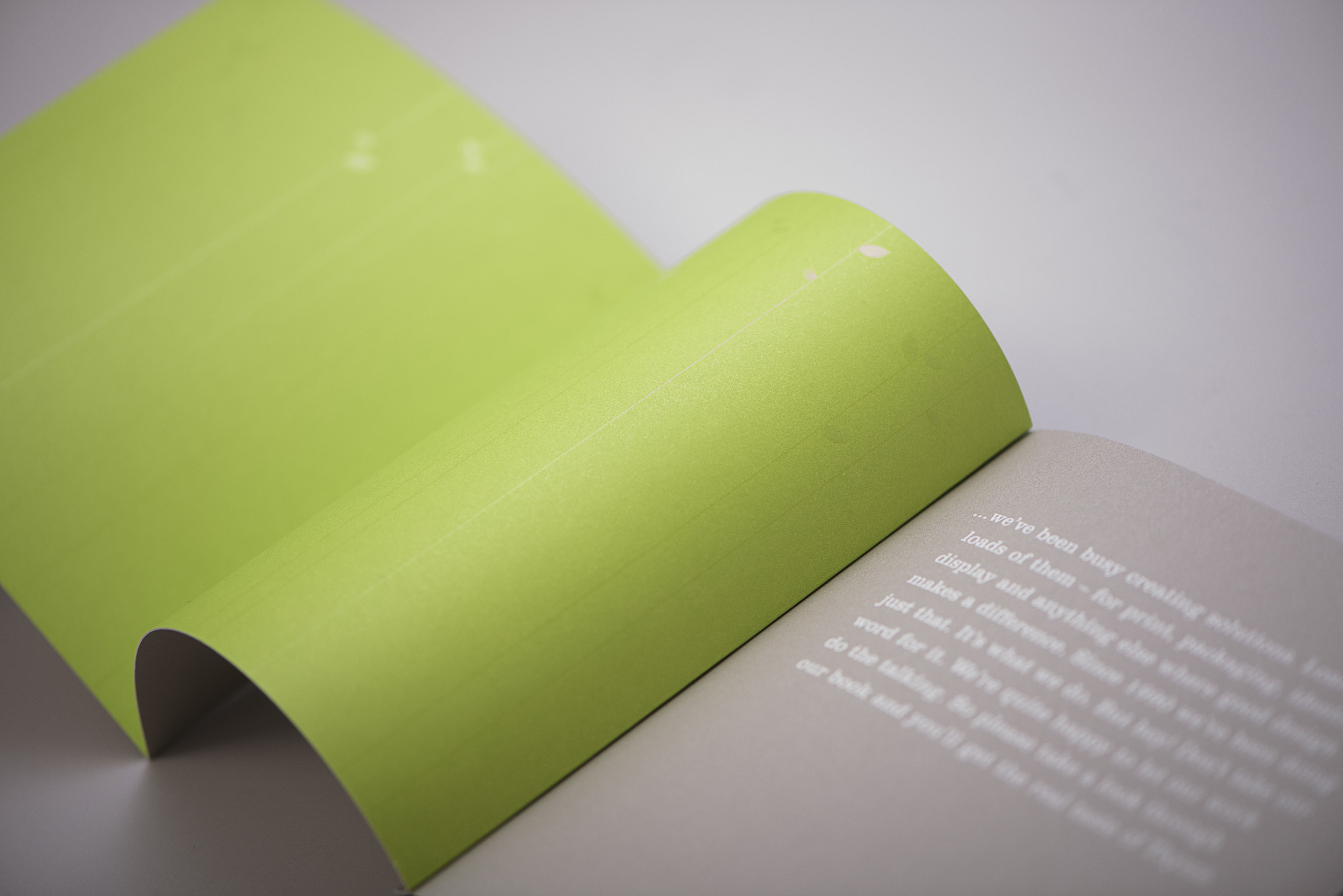
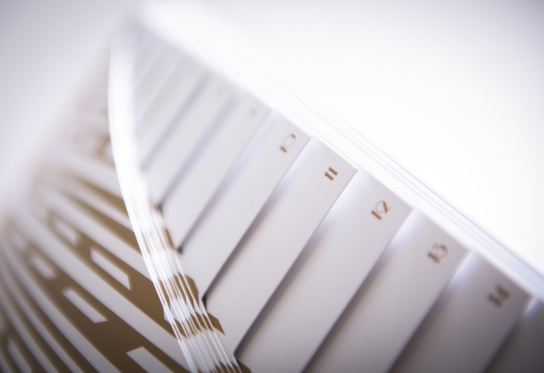
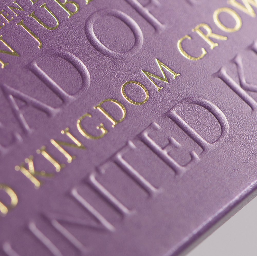
We are well versed in intricate design with print techniques to achieve maximum impact. We consider the entire experience, not just that is has to look great but how the end user interacts with the work. How it is held, the focus, paper texture, unique page sizes, folding, foiling, metallic inks, cutouts, french folds, gate folds, you name it we've done it.
Packaging design comes in many shapes and sizes and each client has specific needs. We apply our vast experience in press printing to get the best out of any type of packaging project. Just as with our print design we consider the whole experience, from materials used to how it feels in hand, throwing in special techniques along the way.
User Interface design is how an app is laid out on screen. We design a set of screens or pages with which a user interacts and ensure that the UI visually communicates the path that the UX designer has laid out. Through our designs we create a cohesive style guide and ensure that a consistent design language is applied across the app.
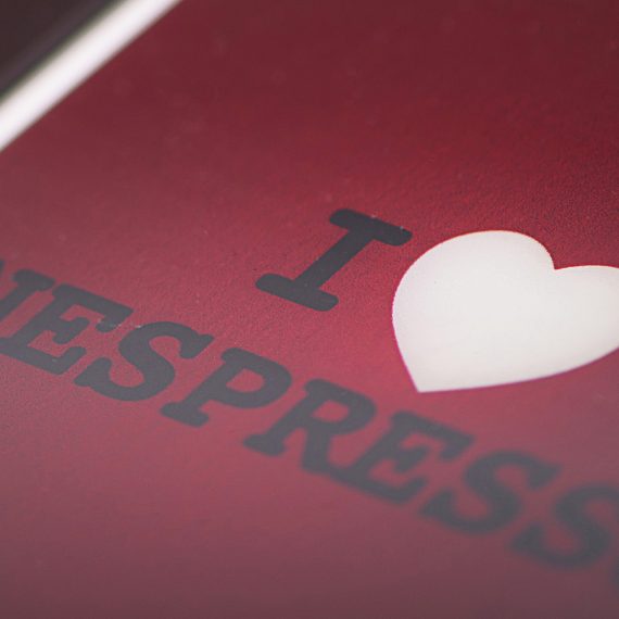
Over the years we have amassed a substantial amount of work!
Selecting just 8 pieces to feature here was extremely difficult so we will change it regularly. Visit our portfolio to see more but note we are currently updating it so it may change before your very eyes!
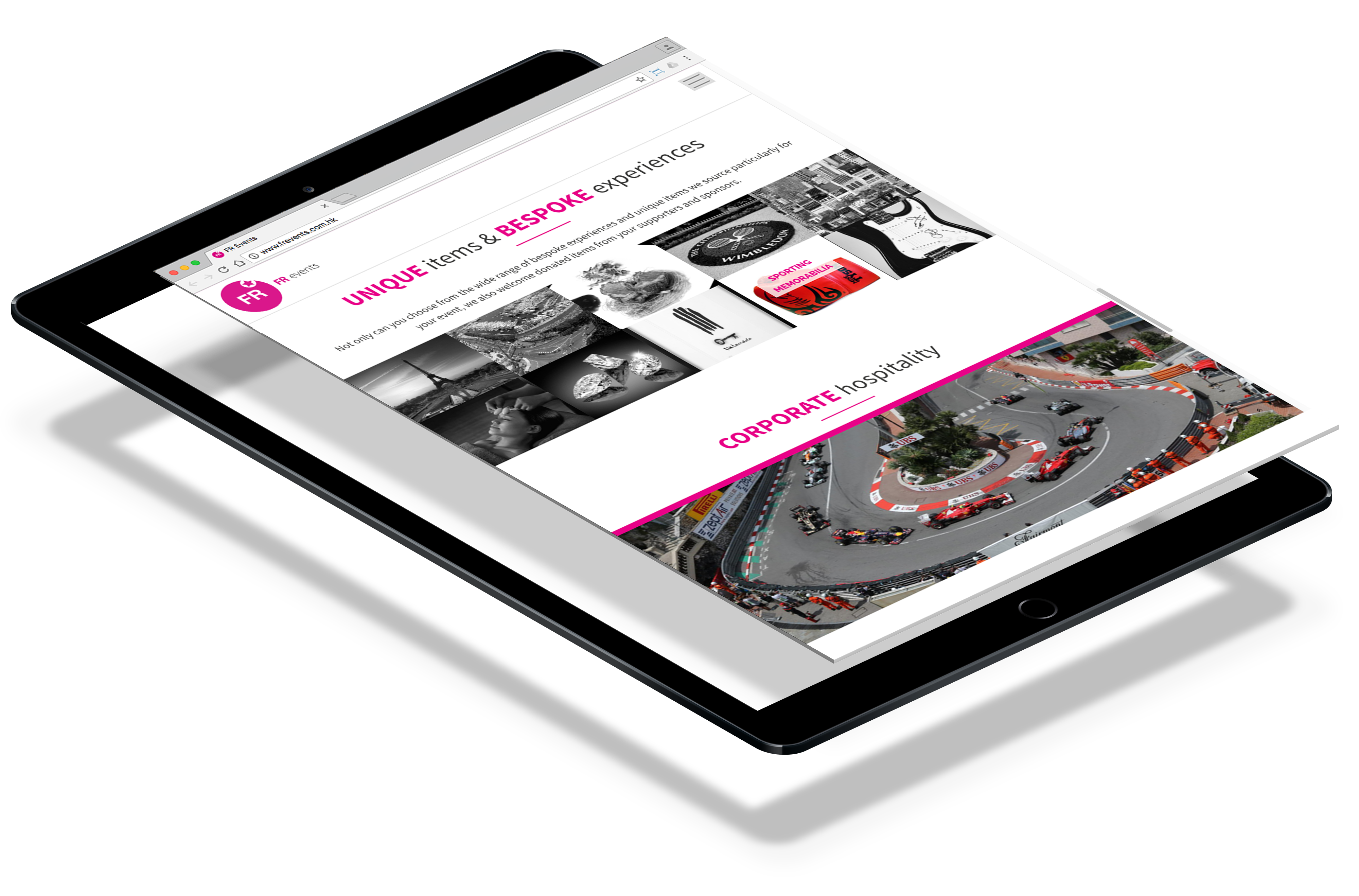
Everyone needs a mobile version of their website, it’s essential. Responsive design is the term for flexible grid layouts, images and an intelligent use of CSS. As we move between laptops to tablets to phones, your website should automatically re-flow to accommodate for varying screen sizes and resolutions.


